
Completion Date :
September, 2024
Clients :
Kabab Corner
Location :
Chennai, Tamilnadu
Industry:
Restaurant
What we did?
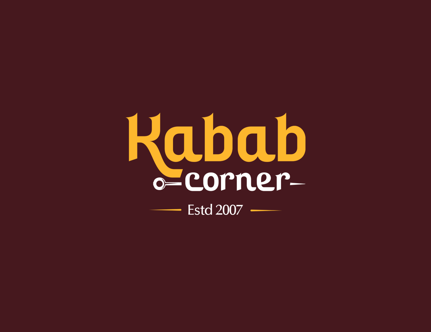
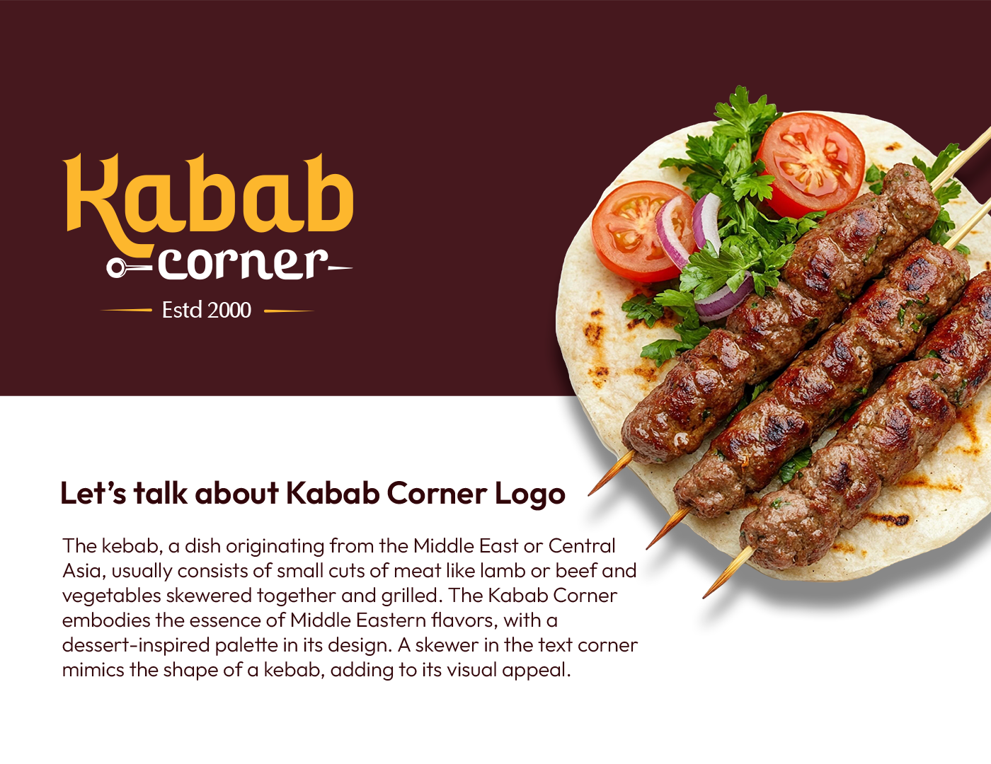
- We creatively integrated a culinary symbol into the typography by designing the text "Corner" to subtly mimic a grilling skewer. This clever visual manipulation immediately informs the customer about the restaurant’s core offering while making the logo distinct and memorable.
- Our team selected a warm, desert-inspired color palette to evoke the authentic atmosphere of the Middle East. These earthy tones not only reflect the geographic origin of the cuisine but also stimulate the appetite and convey a sense of culinary heritage.
- The design embodies the essence of traditional Middle Eastern flavors through a clean yet culturally resonant aesthetic. We balanced modern minimalism with thematic elements to ensure the brand appeals to contemporary diners while clearly communicating the food's historical roots.
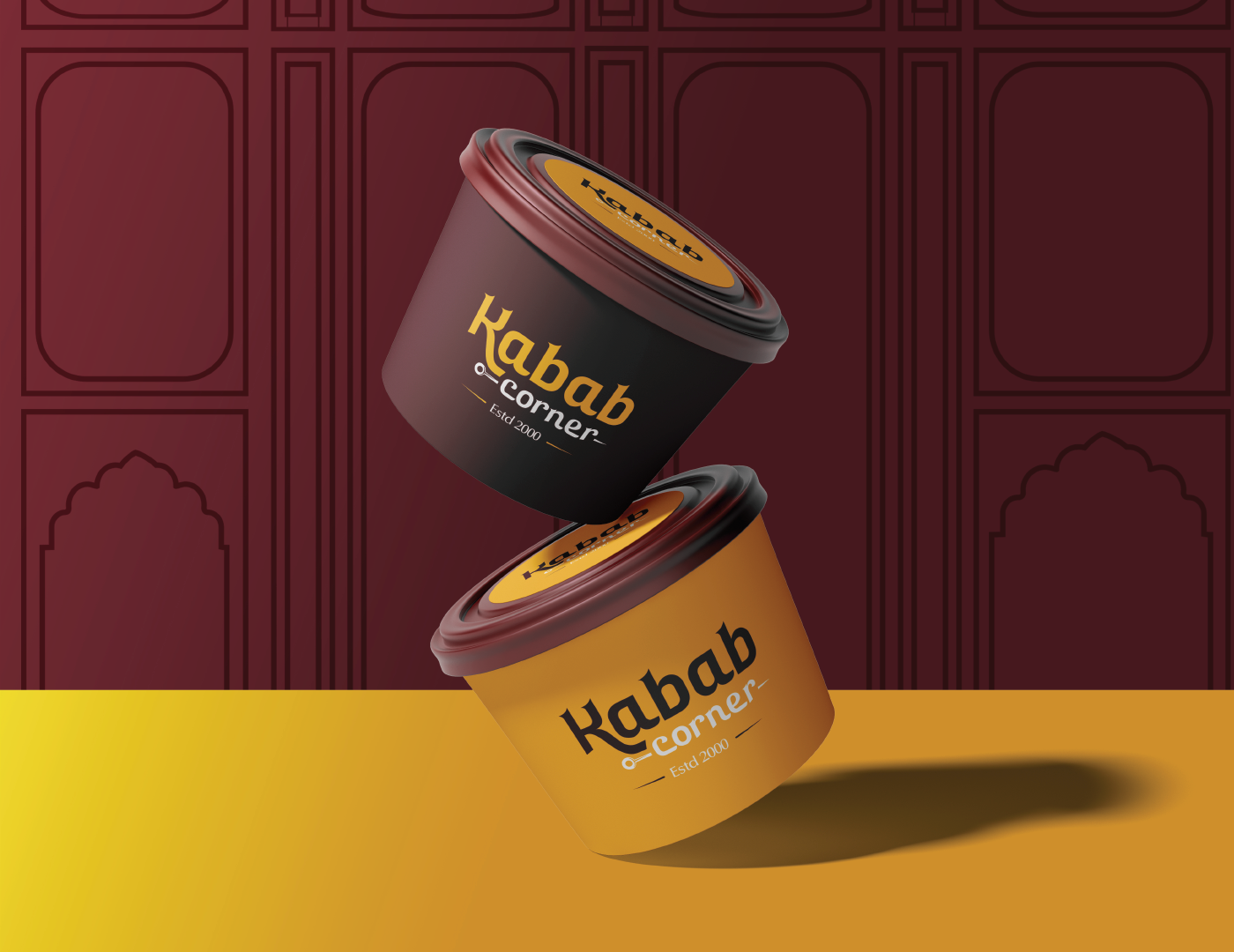
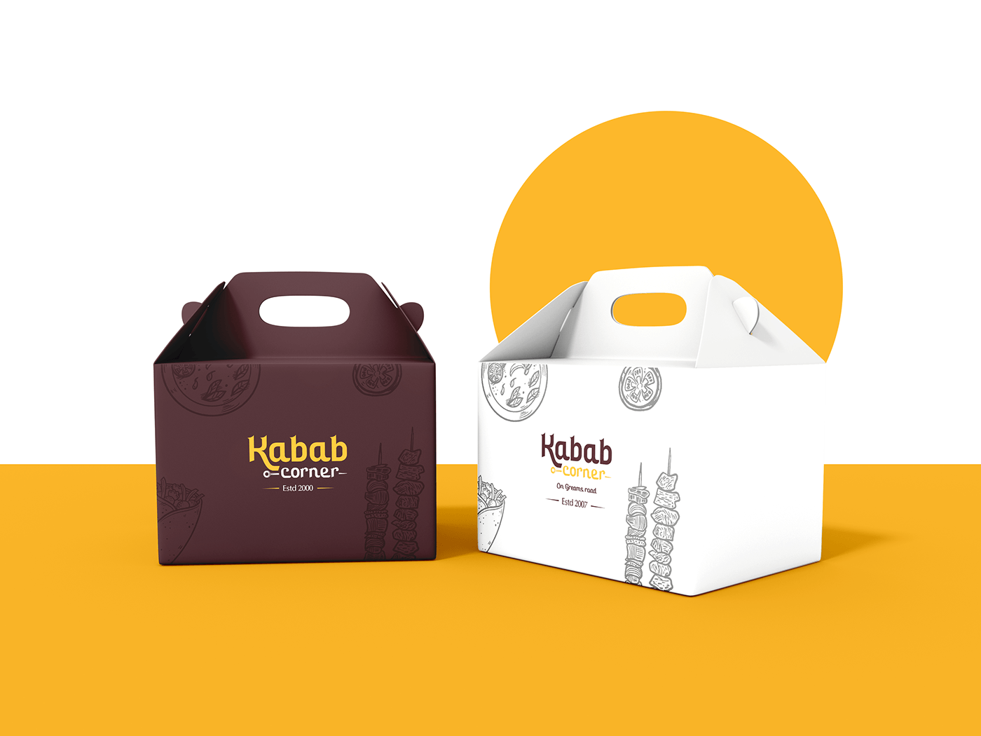
- We ensured the logo's versatility for various applications, from storefront signage to food packaging. The distinct skewer motif remains legible across all scales, helping build strong brand recognition whether the logo is seen on a large street sign or a napkin.
Customer Reviews
“The way they integrated the skewer into the text is genius! It tells people exactly what we serve before they even enter. The warm colors feel authentic to our roots, giving the brand the perfect Middle Eastern vibe we wanted.”
— Owner, Kabab Corner