SBI’s Rebranding: Embracing the Future with a Modern Identity
Adapt or be left behind! This is certainly the mantra for any legacy brands which still hold a candle today. This is certainly a rule which any company would be benefitted from if incorporate. One such company which seamlessly did it was the State Bank of India. SBI’s rebranding time and again proves to be the chief architect of its continued presence in the public consciousness.
An Introduction to SBI would prove to be an exercise in futility. As its presence as a significant financial player since pre-independent India. But it’s this exercise in futility regarding their introduction that SBI liked to maintain. Though SBI held firm ground in the financial market. The digital era paved the way for doubts regarding the future of the establishment. The exponential growth in technology and the ever-increasing demographic of young virtual consumers threatened to leave them behind as a legacy brand. Owing to these potential roadblocks, SBI rather proactively started their rebranding campaign. SBI’s rebranding strategy is simple in theory. Get a modern look but not stray far from what makes them popular, attract young customers while retaining the loyalty of current consumers & create a distinct identity.

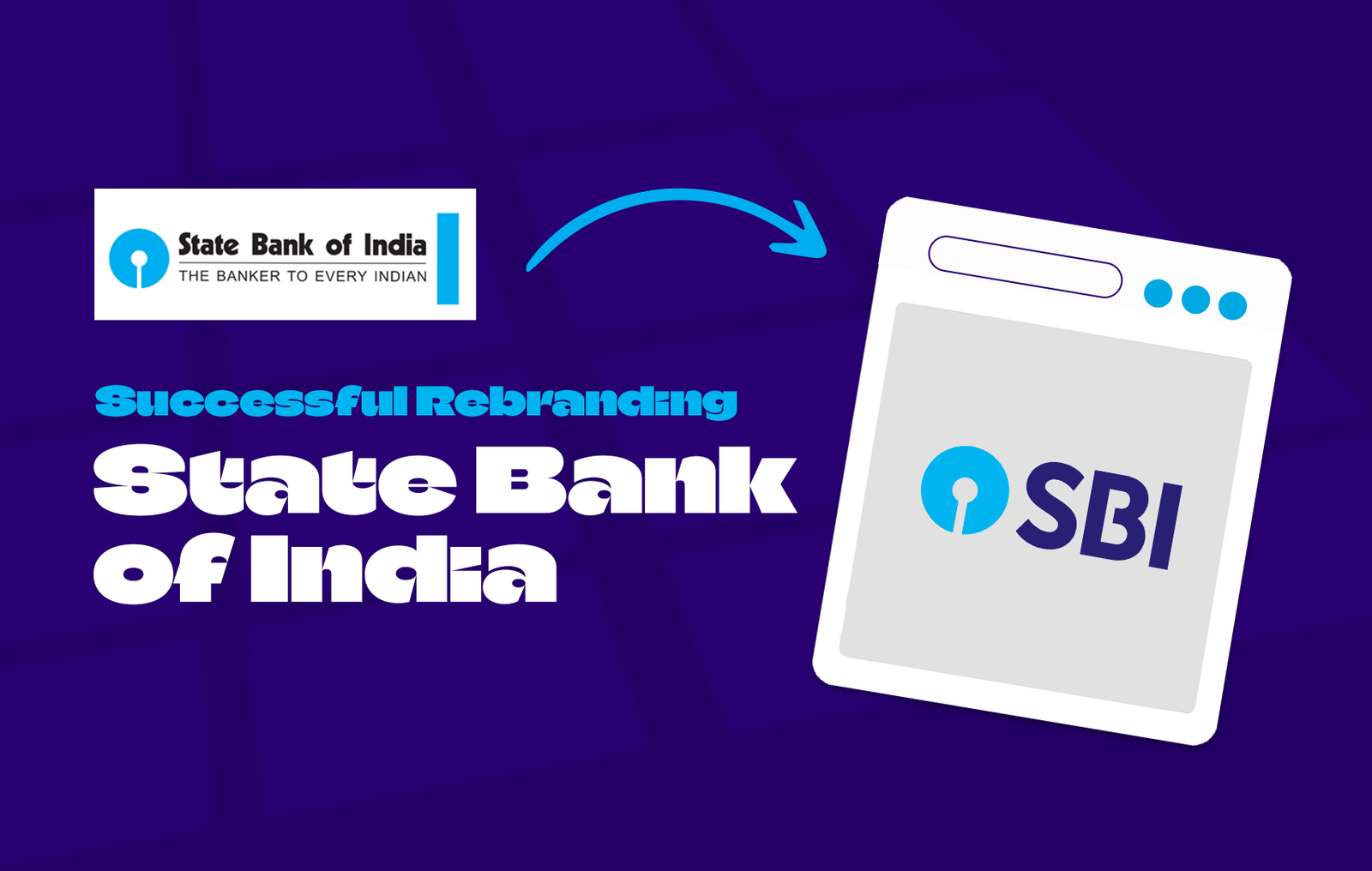
At the heart of SBI’s rebranding strategy is the merger of the iconic SBI monogram with the trademark SBI acronym. This powerful combination not only adds a modern touch but also reinforces SBI’s core values. By tweaking the monogram to increase clarity and refresh the iconic colour of SBI blue. The new logo strikes the perfect balance between tradition and innovation. Reportedly there were talks about dropping the iconic blue keyhole logo altogether for the rebrand, but evidently, that did not come to fruition.
The iconic keyhole symbol designed by Mr Shekar Kamnath represents the token given to each customer of the bank. The simple design aimed to enable even a bank manager to spread brand awareness in a remote village. SBI’s rebranding holds on to this logo and its simplicity. With the modern world’s buzzword being simplicity and minimalism it remains safe from any detriment. But the tagline under the logo did not survive SBI’s rebranding.

“The Banker to Every Indian”. Though this is missing in the rebranded version of SBI’s logo, SBI maintains that it still remains one of its key tenets. Dropping the tagline was purely from a design standpoint. SBI’s rebranding made it a point to declutter and make a more prominent logo. This in turn made it a much more appealing and approachable aesthetic which can be easily incorporated into any adverts or sponsorships.
SBI’s rebranding initiative represents an important step in embracing the future and attracting a younger demographic audience. With a modern brand identity, SBI expresses the desire to connect with diverse audiences in the digital age. Behind the traditional facade lurks a bank that not only symbolizes stability but also embodies the spirit of change. SBI’s rebranding is a testament to the power of reinvention, breathing new life into an iconic organization.


Leave a Reply