

Completion Date :
September, 2023
Clients :
Naga's Gold
Location :
Chennai, Tamilnadu
Industry:
Rice Brand
What we did?
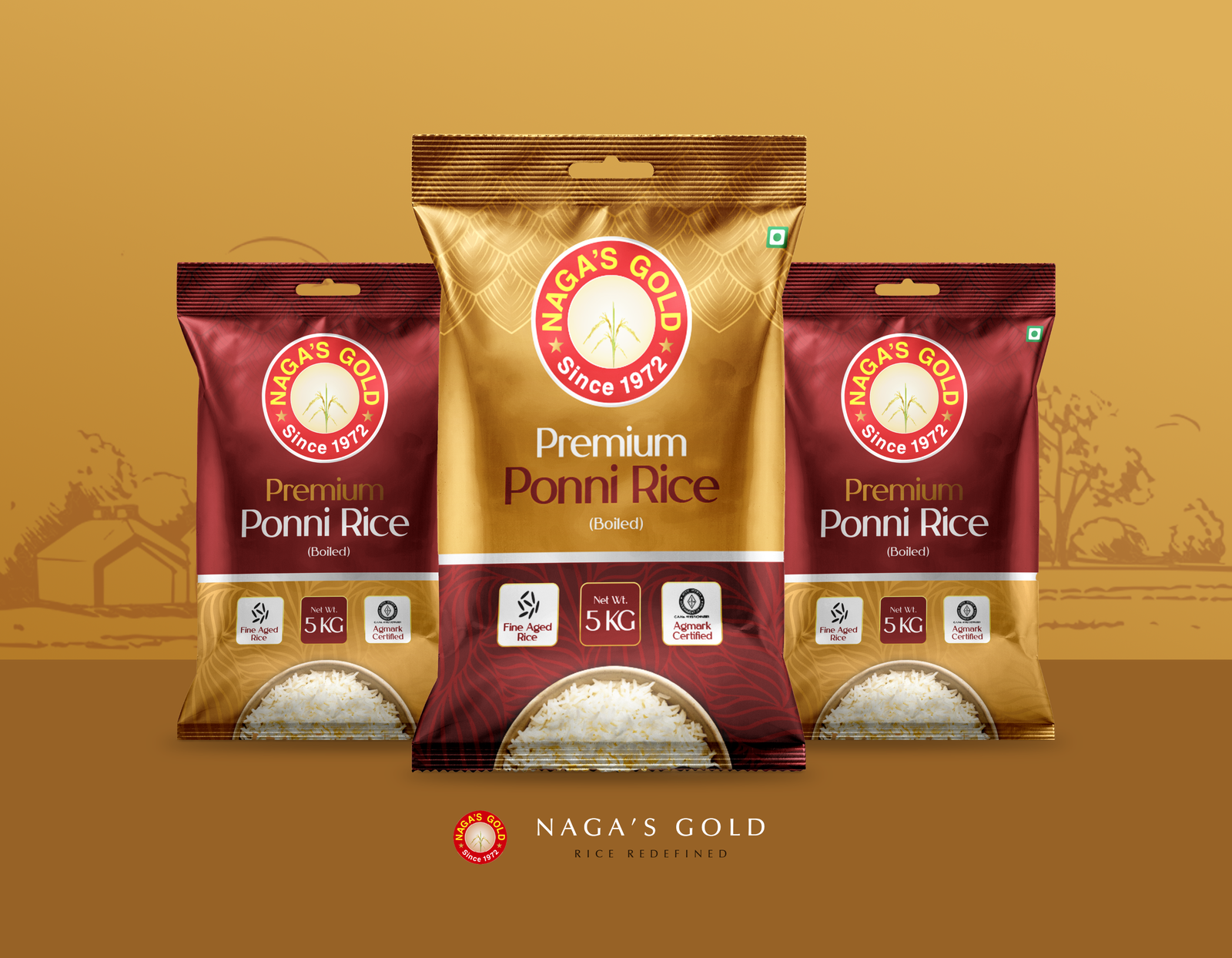
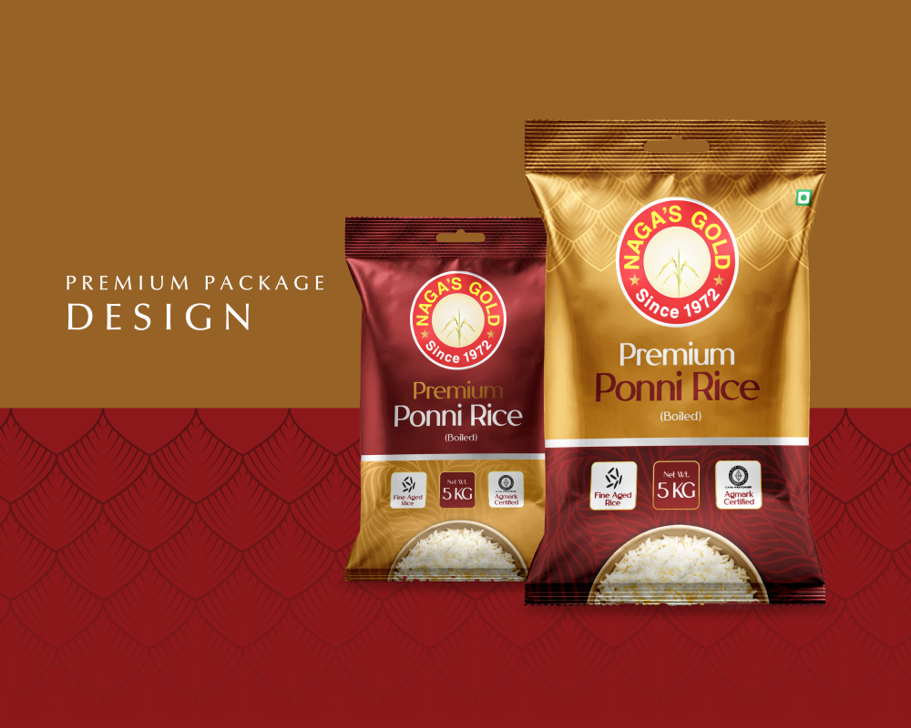
- We developed a premium packaging design that visually elevates the brand's "Gold" standard. By utilizing rich gold foil accents and high-contrast typography, we ensured the product commands immediate attention on crowded retail shelves, signaling superior quality to potential buyers.
- Our team emphasized the "Aged Excellence" USP directly on the front-of-pack. We used clear, appetizing imagery of the grains to visually verify the texture and quality, building instant trust with consumers looking for authentic, premium staples for their daily meals.
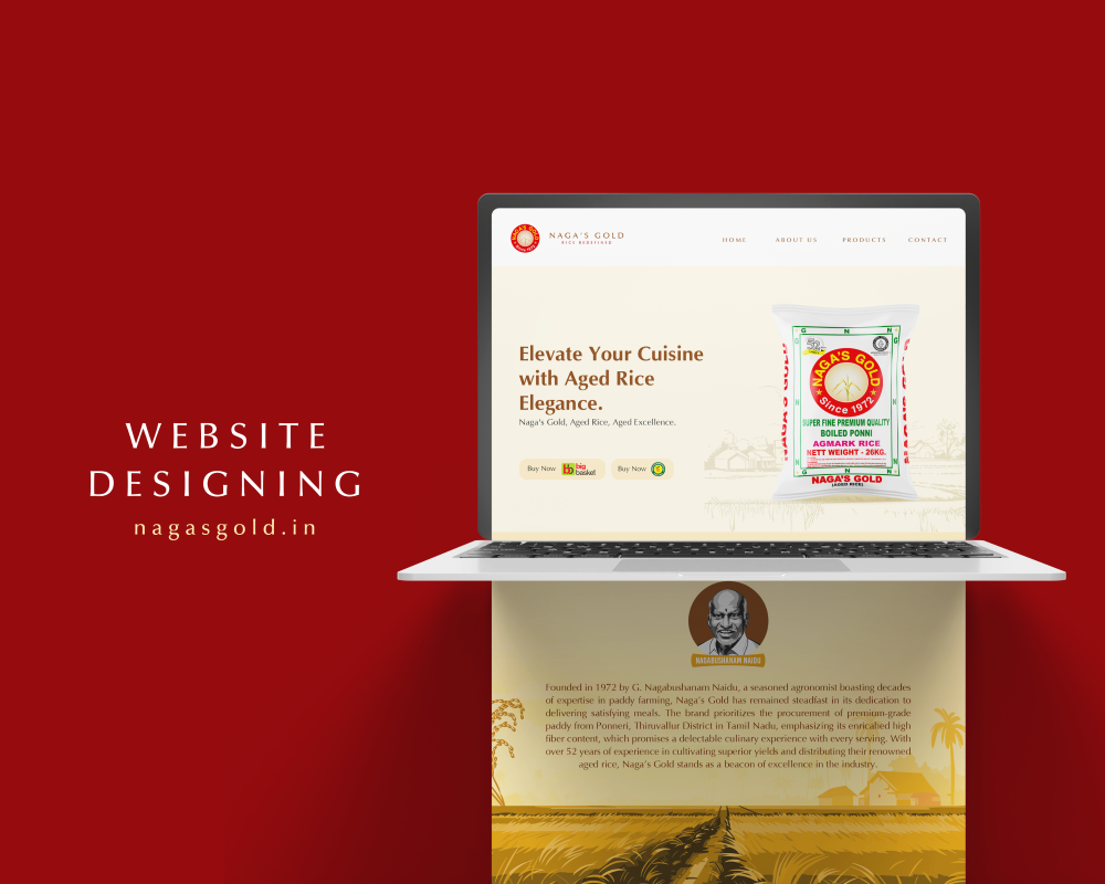
- We streamlined the information architecture on the back-of-pack to make nutritional values and cooking instructions easily scannable. This user-centric approach improved the overall customer experience, reducing hesitation at the point of purchase by answering key product questions instantly.
- The design system was created to be scalable across different weight variants (from 5kg to 26kg bags) without losing brand consistency. This unified visual identity strengthened brand recall across various SKUs, helping loyal customers easily identify their preferred size in any store environment.
Customer Reviews
“The new packaging truly reflects the premium nature of our aged rice. The gold detailing and clear design have not only improved our brand image but also helped us capture a larger share of the modern retail market. Our distributors love the new look!”
— Marketing Head, Naga’s Gold